

You might have come across certain symbols and images associated with brands. Now, why do we see the brand’s name along with those signs or at times, just the image and not the brand name, ever wondered? The answer is, these images and signs are representative of the brand and its characteristic products and services. These symbols and/or images are known as Logos.
Let’s understand a logo in detail:
Logo is primarily a visual representation of the company and solutions and facilities provided by it. In the business world it is known as Business Branding, which plays a significant role in lending any company its distinctive identity making it easily recognisable by people. It is also descriptive of its story and history.
Due to globalization, a distinguishing logo has gained a lot of importance mainly because it represents much more than what is evident.
Let’s look at various advantages it offers:
- Creates a brand identity
- Makes a first good impression
- Takes your business to new heights
- Boosts the number of prospective customers and clients
- Helps build brand loyalty and faithfulness
- Lends a professional appearance to the corporation
Logo designing may seem easy but is quite tricky. You may hire a professional graphics/logo designer but it’s always beneficial to know the basics of logo designing so that you can have more control over your brand’s design and what it exudes.
Logos can be broadly categorized into 6 types:

Brand Mark (or Pictorial mark)
These are defined as those symbols or elements which denote the brand and assist in building and reverberating a brand’s echo. These marks are easy to remember and recognize.
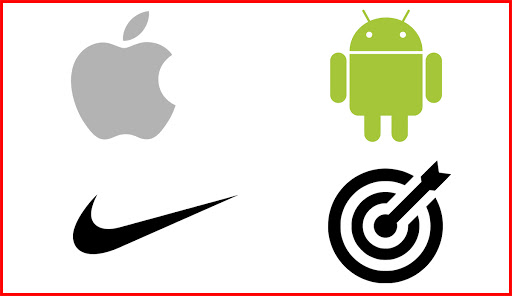
Some of the most distinguished logo design around the world are that of Apple, Nike, Bullseye, Android etc.
Lettermarks (or Monogram logos)
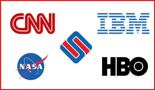
A letter mark is a font based logo including any alphabet or the initials of the company’s name. This is mostly preferred when the name of the corporation is big and you want to compress and make it easier for the clients and customers to recall your company. These can also be opted for in case of a startup especially when you want it to stand out and become more noticeable. Some companies having letter marks include, CNN, IBM, NASA, HBO etc.
Our Sellnship’s logo is also an example of monogram logos where our logo has its initials inscribed in it.
Wordmarks (or logotypes)
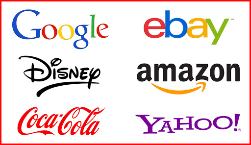
Wordmarks are like lettermarks, font-based, but the enterprise has a distinctly precise name. Some may use a professional font style, while others may opt for some fancier font depending on the brand. Some of the most famous corporations have wordmarks as their logos, like Google, Yahoo, Coca-Cola, Visa, Disney, Amazon, Ebay etc.
The Mascot
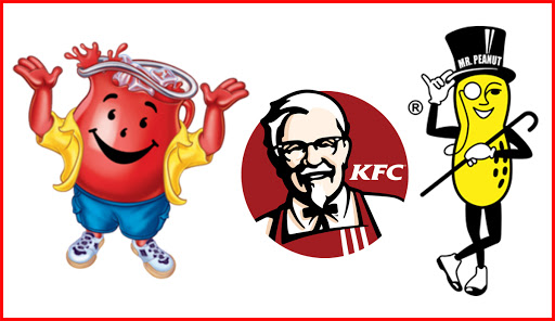
Mascot is basically an animated and cartoonish figure representative of the qualities and values of a character. In the professional world, some companies choose a mascot to personify their spirit of appealing to a wide range of people and appear more welcoming and fun. Its biggest advantage is that it stimulates customer interaction making it a great tool for SMM (Social Media Marketing). KFC, Kool Aid and Planeters Mr. Peanut have some of the most distinguished mascot logos.
Combination Logo
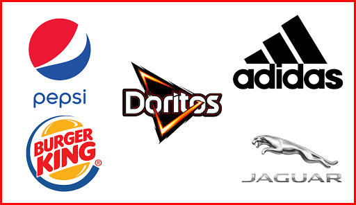
A combination logo is one characterised by the consolidation of text into the image or symbol, and each is inseparable from the other. Some tagline can also be added to it. This type of logo is mostly desired due to its high appeal and adaptability. Adidas, Pepsi, Jaguar, Burger King, Lacoste and Doritos are some of the examples having combo or combination logos.
Emblem Logo
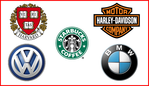
Another major type of combination logo is the emblem logo which consists of the font inside the image with seals, badges and crests. Such logos lend a classic, traditional and highly authoritative image, which is why they are mostly preferred by government organisations and educational institutions. Starbucks, Harley Davidson, Harvard, logo of car companies (BMW, Volkswagen) exemplify emblem logo.
Abstract logo
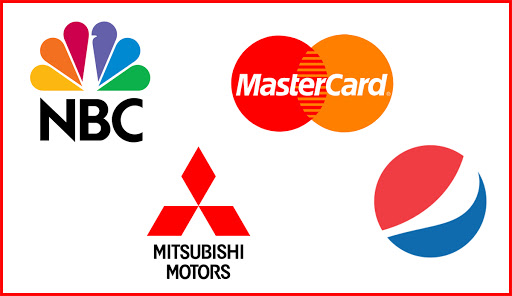
Abstract logo is a kind of pictorial logo which may have abstract geometric, symmetrical or asymmetrical figures instead of easily recognisable figure. Abstract logos communicate a bigger idea and often manifest strategic ambivalence. Some of the bigger brands like Pepsi, NBC, Mastercard, Mitsubhishi have abstract logos representing their companies.
Now that you have a fair idea of the kind of logos, the task just doesn’t end here. It’s time to move forward to choosing distinctive color, font size and style.
Be careful of the colors that you use in the logo as different colors exude different feelings and vibes.
Red is said to be, or rather perceived as energetic, intense and youthful.
Yellow brings warmth and positivity.
Green invokes feelings of peacefulness, strength and stability.
Purple has been attributed with creativity, imagination, and wisdom.
White and black combination lends a balanced and strong image to the logo.
So, you need to choose the color appropriately to target your potential customers and have the right impact on them.
Coming to the font typography is equally essential, as it not only conveys the name of the corporation but also its disposition and character. Many companies associate their brand’s font directly to profits. Choosing the right font be quite complicated, because the wrong fonts might give the wrong message. Fonts have an identity of their own. They can be very experimental, casual and/or sophisticated.
The aforementioned parameters apply to all enterprises and their target audience. Also, you can contact sellnship for designing your logo and help your company to make a stronger impact and gain a wider reach.